Did the world go blind suddenly?
I’m not sure if it’s just me or if the world suddenly went blind.
All I’m seeing nowadays in terms of UX and design assumes the use of very large typography.
Facebook is testing out in certain countries the possibility for users to increase the font size in their posts and all of the sudden everybody started writing shitty posts with <h1> tags.
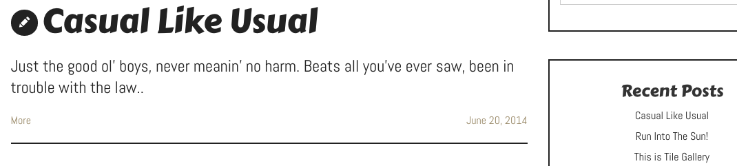
UX developers use very large fonts for titles and content and very small fonts for sidebar and meta’s which makes things look so fucking disproportionate:
One screen designs that told everything the visitor wanted have been replaced by full screen photo’s, slideshows and shit that don’t say much.
Even previously condensed forum designs have gotten ugly nowadays by displaying very large titles and text.
Where the hell is UX going with this?


Written by Malin
Self taught IT enthusiast with over 16 years of online background experience. On top of that I'm a blogger, webmaster, husband and father.